Hydrogen is the most abundant element in the universe. It forms the bulk of
the mass of stars and giant planets. The Galaxy itself is filled with
hydrogen, with rarified regions at densities as low as a few dozen atoms per
cubic meter and star forming regions with densities as high as 20 million
atoms per cubic meter. This gas takes part in the rotation of the Galaxy.
It is clumped together in spiral arms. It is moved around by shock waves
from supernova explosions, forming spherical shells of denser gas hundreds
of light years in diameter. Where this gas is densest, new stars form. Some
of these new stars will explode as supernovae, causing new shells of gas
to form, and triggering new star formation. This feedback loop has been
going on since the Galaxy formed.
If we want to understand any of these mechanisms, it's important to understand
how hydrogen is distributed in the Galaxy.
The SETI@home data system presents a unique mechanism for looking at hydrogen
in the Galaxy. It is
situated at the largest radio telescope in the world, which provides the best
available imaging resolution that can be achieved with a single telescope.
Because the frequency band it receives is centered near the 1420.4 MHz
frequency emitted by hydrogen, the data tapes output by the SETI@home data
recorder can be analyzed to extract information about hydrogen distribution
in the Galaxy.
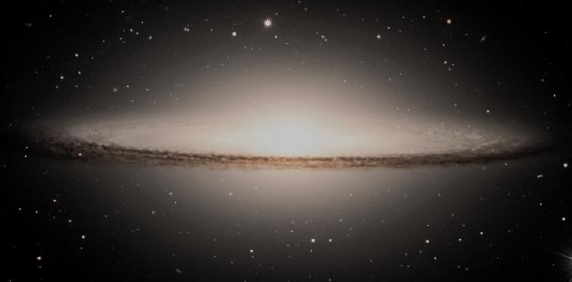
Image of Sombrero galaxy courtesy European Southern Observatory, © 2000
Like the stars in the Galaxy, hydrogen is mainly distributed in a large disk,
like the one shown (edge on) above. Down below we have a vertical cross
section through the disk of the Galaxy near the sun.
The sun is the yellow circle is embedded near
the plane of the disk. The grey fluff respresents the hydrogen gas.
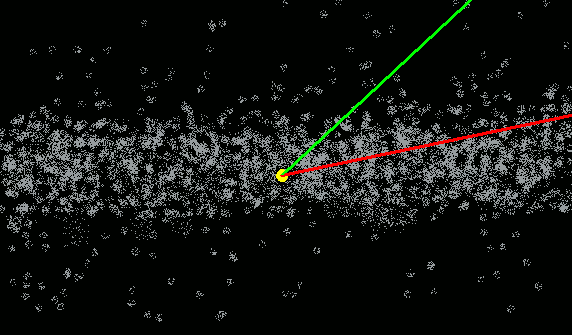 As you look along the disk you see more hydrogen than you do when you
look perpendicular
to the disk because you are looking a longer distance through the thick
layer of hydrogen. The more hydrogen there is along a line of sight, the more
intense the radio emission will be.
The plot below shows the spectrum along
two lines of sight (shown schematically by the lines above). The red curve is the spectrum
along a line of
sight 5 degrees from the plane of the Galaxy (shown by the red line above).
The green curve is along a
line of sight 25 degrees from the plane of the Galaxy (represented by the
green line above). You'll notice that,
as expected,
the intensity of the hydrogen emission is higher when you are looking
along the plane of the Galaxy.
As you look along the disk you see more hydrogen than you do when you
look perpendicular
to the disk because you are looking a longer distance through the thick
layer of hydrogen. The more hydrogen there is along a line of sight, the more
intense the radio emission will be.
The plot below shows the spectrum along
two lines of sight (shown schematically by the lines above). The red curve is the spectrum
along a line of
sight 5 degrees from the plane of the Galaxy (shown by the red line above).
The green curve is along a
line of sight 25 degrees from the plane of the Galaxy (represented by the
green line above). You'll notice that,
as expected,
the intensity of the hydrogen emission is higher when you are looking
along the plane of the Galaxy.
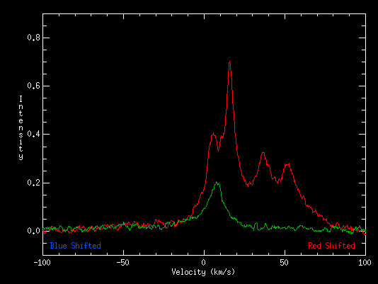
The other thing you will notice is that the shapes of the plots is
different between the two. That is because the hydrogen in the Galaxy
is moving with respect to us. Because it is moving, the radio waves it
emits will either be red-shifted if it is moving away from us, or blue shifted
if it is moving toward us. In the red spectrum above we see four obvious
peaks in the spectrum, so we are seeing hydrogen moving at four different velocities.
In the green spectrum we only see a single obvious peak. The reason for the
difference is that hydrogen in the Galaxy rotates about the center of the
Galaxy in a manner similar to the way the sun does.
When we look out of the plane of the Galaxy, our line
of sight leaves the dense hydrogen at a point relatively nearby. So in the
green plot, we are seeing hydrogen that is nearby and is rotating around
the Galaxy at about the same speed as the sun does. When we look along the
line of sight along the plane of the Galaxy, we see hydrogen that is farther
away, and is moving at a different speed and in a different direction than the
sun is.
That doesn't fully explain why there are peaks in the spectrum, though. There
are peaks because hydrogen is not evenly distributed in the Galaxy. Hydrogen in
the Galaxy is more concentrated in the Galaxy's spiral arms, and less
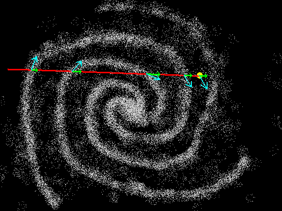
concentrated elsewhere. The image below represents a top down view of the
Galaxy. The yellow dot is the sun, and the red line is a line of sight that
we have chosen to illustrate this point.
The blue arrows show the direction that the sun and the gas in the spiral
arms is moving as it orbits the center of the Galaxy. When we measure the
spectrum, the only part of the velocity we can measure is the portion directed
along the line of sight, shown by the green arrows. The gas in the spiral arm nearest the sun is moving
at the same speed and direction as the sun, so its measured velocity will
be near zero. Nearly all of the velocity of the next spiral arm is directed
toward the earth. It is moving faster toward the sun than the sun is moving
away from it, so it would appear blue shifted. The velocity of the gas in the
farthest spiral arm is nearly perpendicular to the line of sight. It's not
moving toward us as fast as we are moving away from it. Its radio emission
would appear red-shifted. By studying the shape of the spectrum we can learn
about where structures like spiral arms are located in the Galaxy.
Now you know everything there is to know about hydrogen in the Galaxy. Not by a
longshot! We astronomers don't know a tenth of what there is to learn about
hydrogen in the Galaxy.
That's why we're going to take the SETI@home data
tapes, and use them to generate 11 million spectra like the ones above. We'll
use the spectra to make maps of hydrogen distributions in the areas of the
Galaxy visible to Arecibo. We will make these maps available to anyone who
wants to use them to study the Galaxy.
For more technical details about this project, you can check out a presentation
given at a conference at the ``Seeing Through the Dust'' conference
at the Dominion Radio Astrophysical Observatory in October by clicking
here.
| |
