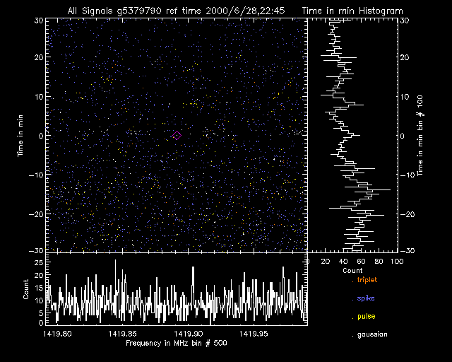
An important step in SETI@home's signal detection process is to identify radio waves that remain consistent in frequency and location across time. Persistency graphs are used to examine the details of these persistent events, and multiple graphs are often used together to compare event characteristics as well as focus on specific distributions of spikes, Gaussians, pulses, and triplets.
The graph itself is actually a combination of a waterfall plot and two histograms, all of which are explained below. Although a persistency graph might plot any two variables against each other (on the x and y axes), as an example we'll use a frequency-by-time persistency graph.
|
Click for a full-sized graph
|
|
| Graph label |
|

Each persistency graph has a label at the top describing which types of events are plotted ("All Signals," "Spikes," "Gaussians," "Triplets," or "Pulses"), the ID of the identified persistent event, and the time when the event was detected.
|
|
|
| The waterfall plot |
|
 |
The upper-left portion of the graph contains a box of dots—each dot is a detection plotted across time (the y-axis) and frequency (the x-axis). At the very center of this plot is a purple diamond marking a target event. We've identified this event as persistent with one or more other events from the same location in space. If the graph is a plot of "All Signals" (see the graph label), the points are multicolored with blue spikes, white gaussians, yellow pulses, and orange triplets; otherwise, all points are white.
|
|
| The frequency (x-axis) histogram |
 |
The frequency histogram shares its x-axis (frequency) with the waterfall plot. It shows how many events in the vicinity of the target event (the purple diamond in the waterfall plot) are at each frequency. A spike in the histogram (at 1419.903 MHz in the sample graph, for example) means that there's a particularly large number of events detected at that frequency. These histogram spikes typically represent RFI bands; if a target event has the same frequency as one of these bands, it's likely the event is rfi. |
|
| The time (y-axis) histogram |
 |
The time histogram shares its y-axis (time) with the waterfall plot. As more events at different frequencies are detected at specific times, the line will spike to the right—a characteristic of a broadband signal. Since broadband signals require a great deal of energy to produce, the source of such signals is most likely either astronomical phenomena or rfi.
|
|