SETI@home: Curve-Fitting Graphs
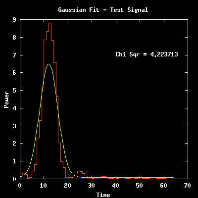

Candidate signals from a distant transmitter should get stronger and then weaker as the telescope moves over that point in the sky. Specifically, the power should increase and then decrease with a bell shaped curve (a gaussian curve). SETI@home clients search for this characteristic shape. In these plots, the red line indicates the data gathered at the telescope. The yellow (smooth) line traces the "best fit gaussian" for the data set. The lower the Chi Sqr, the better the fit. The first plot shows the SETI@home client program detecting a gaussian fit to a very strong signal; this test signal was artifically injected to insure the hardware and software were working correctly. The second plot shows a gaussian fit found by a client in a typical work unit. The work unit contains only noise (no signal is present), but noise will occasionally look like a gaussian just by chance.
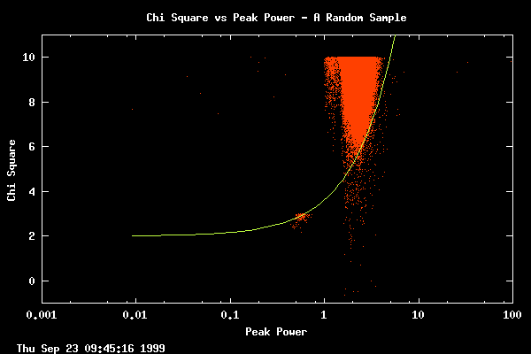
The distribution of many gaussian fits, plotted from a random sample of all of our data up to the date of the plot. For each gaussian detected by a client, this graph plots that gaussian's peak power and chi square (chi square is a a measurement of how well the gaussian curve fits the data). The most interesting candidates are those in the lower right corner of the plot, with a low chi square (good fit) and a high power. We have defined the region of "top" gaussians and this is plotted by the yellow line. The line is actually straight - it appears curved because of the log scale on the peak power axis. It is this region of top gaussians that is further explored in the following graphs. Note that the client programs do not report Gaussians with chi square fit greater than 10 (these are poor fits).

Here is a plot of all top gaussians to date. This is the data set used to produce the following graphs.

Here we ask how many gaussians were found at each of the frequency resolutions that the Seti@Home clients examine. We see no gaussians at the three finest resolutions because we do not perform gaussian fitting there. This is because the time resolution is too poor at these fine frequency resolutions to yield enough time elements. There are two reasons that we see few or no gaussians at the coarse resolutions. One is that we perform fewer fits as the resolution becomes coarser. That is, we see fewer because we look less often. Secondly, narrow band signals do not rise above the noise as easily at coarse resolutions. Thus, unless the signal is very strong, it will not be high enough off the noise floor for the gaussian routine to report. Because we are able to see weaker narrow band signals at higher frequency resolutions, the following plots were made using the gaussians discovered with a .6Hz resolution.

This plot shows how many interesting gaussians were detected at each chirp rate employed at a frequency resolution of .6Hz.

This plot shows how many interesting gaussians were detected at each frequency that was examined at a resolution of .6Hz.
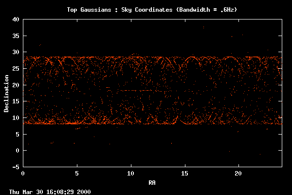
Here we see our most interesting gaussians distributed across the sky.
The clustering at the high and low declinations is due to the fact that
as the telescope slews across the sky (in order for the feed opposite the
SETI feed to track an object), the telescope movement naturally slows
at the far declination reaches. Thus, we see more gaussians
because we spend more time looking in those regions.
|